Introduction
If you have only used a word processor to edit text and are used to formatting that text by dragging a mouse pointer over it to select it followed by clicking on toolbar buttons to get the effect you want then you're likely to struggle when it comes to web design. However, if you have encountered your word processor's "template" facility you'll be in a much better position as that's the equivalent of a "theme" in WonderCMS.
A word processor's template and WonderCMS's theme both do the same two things. They define the various elements that will appear in the document and how they will appear. You may have played with a word processor's letterhead, minutes, resumé, CV, or business card templates. WonderCMS is similar. Its themes are designed to help build various kinds of site, a blog, a site dedicated to your hobby or one for a voluntary organisation or business.
How It Works
 Here we see a newly created WonderCMS site with the
"GregCustom" theme installed.
Here we see a newly created WonderCMS site with the
"GregCustom" theme installed.
The great thing about a theme is that you don't need to remember how to match previous headings or other elements of your content. Just tag the text accordingly and the theme adjusts the appearance for you.
A WonderCMS theme contains two key files. One controls the general structure of the page, by which I mean, for example, whether each page has a distinct header area that brands the site as yours, whether the main site navigation appears above or below the header, whether every page will have a footer or side-bar areas, intended to contain adverts, contact details or links to parts of your site that may be buried deep in the menu system. The other controls the appearance of the various structures that the theme contains, the colour scheme, the fonts used for headings and body text, spacing around these elements, whether the main navigation menu runs horizontally or vertically and how any of the structures might need to move around on small or narrow screens and windows.
Some Cautions
One trouble you may face with any theme is that it may not include the code for a feature you want on your site. Unfortunately, that is the nature of the beast and the price you pay for avoiding learning how to add the code that is required. It is possible to use the Summernote editor to write the code for you but that is not something I'd recommend unless you know the situation is unique and will not be repeated elsewhere on your site.
If a feature you want is missing from a theme it is best practice to add the appropriate code to the theme. Summernote won't do that and that is why I don't recommend using it with the GregCustom theme which is designed for larger sites and almost any additional structure is likely to need to be repeated somewhere on the site. Obviously, editing a theme does require some knowledge of HTML and CSS and that's why I feel it really is worthwhile learning a little of the technicalities and why a very basic introduction of these follow.
Content
In a web site the content of each page is held in a separate file or as a single record in a database. WonderCMS uses the latter approach. You may have scores or even hundreds of related pages to display that form the complete site. These files and entries contain plain text that have added "tags" that tell the browser how text is to be rendered, whether it is a heading, a paragraph, part of a list, and so on. It is vital to recognise that HTML tags define the function of the rather than its appearance. Most of these tags come in opening and closing pairs and often they are nested within each other.
It's stating the obvious that you cannot embed an image, video or audio file in a plain text file. Instead, you insert a tag into the file, that tells the browser the location of the file that holds such material. These various tags form the basis of HTML (HyperText Markup Language).
The snippet of HTML code you see below comes from a newly created WonderCMS based site after the GregCustom theme has been installed. The illustrations on this page are all from the same site.
It produces the text that appears within the default light grey header area that will appear on every page of the site, although, as you'll see below, the theme's documentation includes instructions on how to change the colour scheme completely with a simple copy and paste operation. The text "Website title" is wrapped in opening and closing [h1] tags so it appears as a primary heading as well as tags to give it special emphasis [em]. The second line also tagged as a primary heading but without the special emphasis. What this code does not say is how primary headings should appear and what effect the special emphasis will have.

Another example can be seen after you have installed the GregCustom theme and as soon as you login. You see main heading on the top line wrapped in an opening [h1] tag and it's matching closing tag [/h1]. The following three lines show sets of paragraph tags [p] and [/p]. The first of these includes some bold text, surrounded by [b] tags. The second includes an anchor tag. These are used when creating links to some other page. They include a reference to another HTML file, hence the " href="xxx" " (known as the tag's "attribute"), where the xxx is the address of that other page. This particular link is given the class "button" which we will see later has the potential to affect that element's styling.
Styling
As a WonderCMS user you don't need to worry about styling. It's all looked after for you by theme. It's only if you add a feature yourself that you will need to know this stuff. But it may still be worth knowing as it will help you understand what WonderCMS is doing in the background.
By default, a browser will render a page according to its own built-in "stylesheet". For example, a heading will appear in larger type than other text and will be in bolder type and have a wider margin beneath it. A site can over-ride the browser's default rules by adopting the styles in its own sytlesheet. Where HTML tags are nested within each other the inner tags normally inherit their styling rules from those in the outer tags. Rules are said to cascade. Hence the language in which they are written is known as CSS (Cascading StyleSheets).
In the stylesheet built into the "GregCustom" theme there is no button class defined, so under this theme it is displayed in the same way as any other link. (The stylesheet for the default "Sky" theme does have rules for that class and it produces the large white ovals around that text.) The example CSS code that you see below determines how the heading tags in the HTML snippet above is rendered by the browser.
You'll notice the code references the "header", so these rules only apply in the header area at the top of the page. As you will guess, the first part determines the aspects of the font to be used, its colour and size. Margins and and padding determine the space around the heading. It is possible to have a border around a tag. Padding is the space inside the border, margin is that outside. In this example padding only has a single figure. That means it will be used above the tag and also used on all the other sides. If you add further sizes they will be used on the right, bottom and left sides. Where there are missing third and fourth figures, it is the size from the opposite side that will be used.
The second part determines how the emphasised text will vary from the standard heading within the header. There's a different font, size and colour and, in this case, it won't be bold, as is the default for a heading. Other aspects of its appearance will be inherited from the styling for the tags in which the heading is wrapped or even the browser defaults.
The GregCustom Theme
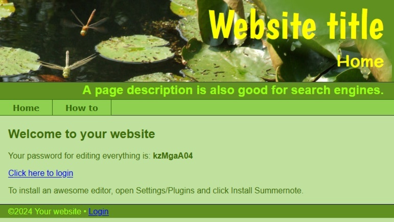
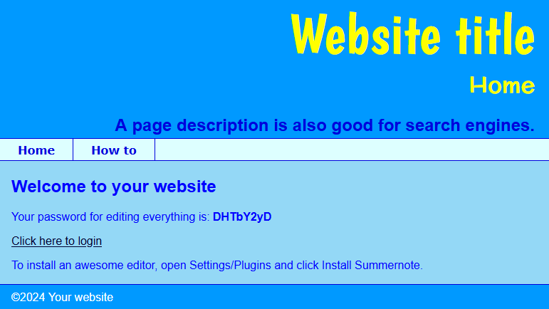
The definitions for all the colours that are used in the GregCustom theme are listed at the top of the stylesheet file, making it very easy to change the site's entire colour scheme. Illustrated above are two of the alternative colour schemes, the code for which appears in the theme's documentation. You can copy the code and paste it into the stylesheet to give your site a dark blue, light blue and light green scheme. For one example there are images to use in the header that demonstrate what can be achieved. Another thing you'll see on this site is that on narrow windows or mobile devices the header changes to a left aligned format. There is no particular reason for that feature. Call it showing off, if you like!